Silent Night, Deadly Night Part 3: Laundry Day: The Revenge
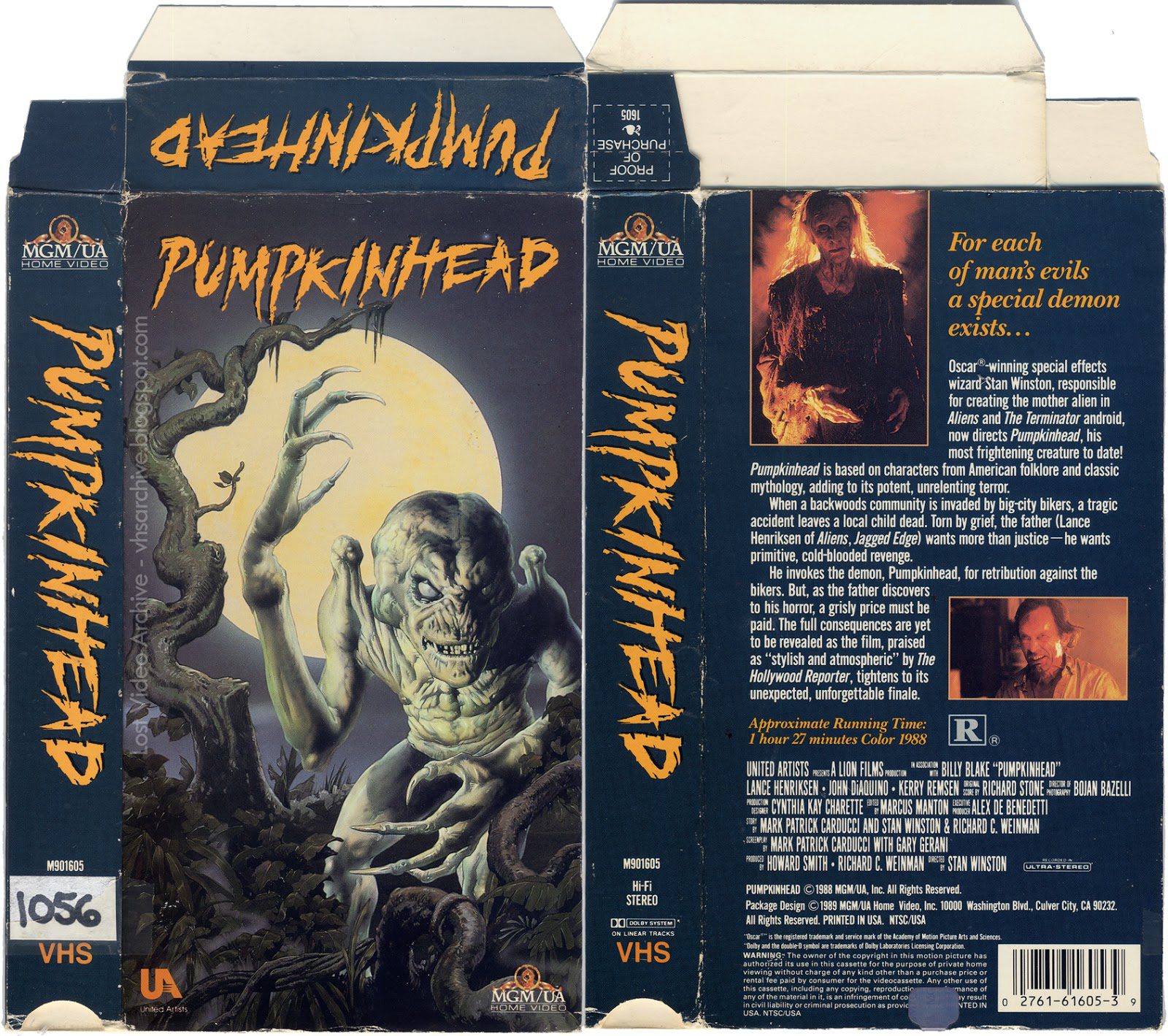
If you go back and look at the covers for old horror movies circa the 1980’s, you’ll notice something about them. Compared to the designs for DVD cases today, they visibly pop. They do an excellent job of drawing the eye, especially to their horrors. And that’s not by accident, as Entertain The Elk explains in his video Why Horror VHS Artwork Was So F*cked Up:
In much the same way as with editing trailers now, the AIDA method was an art that reached its peak back then. A method by which they drew the eye to a specific (often central) portion of an image using both color and placement to entice viewers. VHS cases were its perfect canvas. And yet, it’s puzzling as to why many companies no longer use it, or use it sporadically.

As Entertain the Elk goes into in his video, modern video releases, as well as services like Netflix, go to relatively generic designs. In much the same way that movie posters currently have a trend towards blue & orange over the more romantically designed posters of the past, they’ve lost a bit of that visual richness that entices viewers. And while that probably saves them some amount of money, one has to wonder if that’s really the best way to sell their products.